

Color Palettes That Make Modern Small Bathrooms Feel Larger and Brighter
Table of Contents
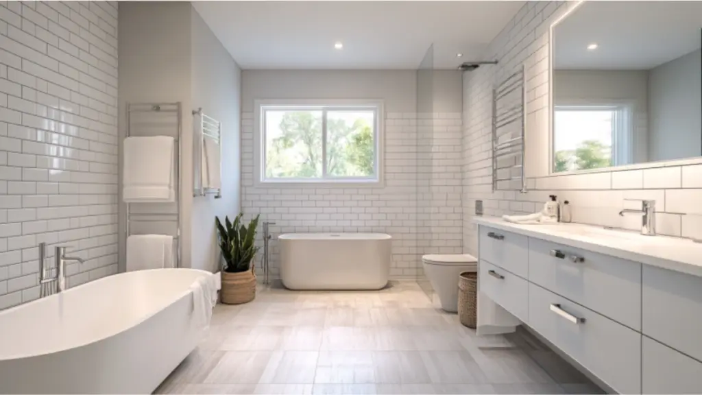
White remains a timeless go-to in bathroom design, especially for smaller spaces. It reflects light better than any other color, instantly brightening up tight quarters. When layered with off-white or warm undertones like ivory or cream, the effect becomes softer and more inviting—less sterile and more serene.
Designers often favor white for modern aesthetics because it allows fixtures and textures to stand out. Pairing white walls with glossy tiles, floating vanities, or brushed metal accents enhances dimension without adding clutter. The key is to use different shades of white to add subtle contrast and visual interest.
For added depth, try incorporating textures—like beadboard, shiplap, or matte vs. glossy finishes—to avoid a flat look. And don’t overlook lighting: white surfaces bounce natural and artificial light more effectively, making everything feel open and illuminated.
Layered Whites for Modern Bathrooms
| Element | Recommended Finish | Notes |
| Walls | Matte cool white | Avoid glare, adds softness |
| Tiles | Glossy white subway tiles | Reflects light, adds clean texture |
| Vanity | Off-white or ivory | Warms up the palette |
| Accessories | Brushed nickel or chrome | Complements without overpowering |
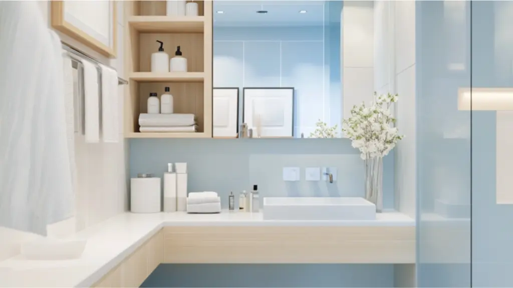
Soft pastels that subtly open up the space
Pastels aren’t just for nurseries anymore—they’ve made a comeback in modern design, especially for small bathrooms where a bit of color can go a long way. Soft hues like powder blue, mint green, blush pink, or lavender offer a delicate touch of personality while still reflecting light and maintaining an open feel.
What makes pastels particularly effective is their versatility. They pair well with white, beige, and natural materials like wood or stone. For instance, a mint green wall with white trim and light oak shelving feels breezy and modern. Pastels can also be used selectively—for example, just on cabinetry or in a statement tile pattern—to avoid overwhelming the room.
Tone-on-tone pastel color schemes (e.g., blush with pale rose or powder blue with navy accents) can provide subtle depth while preserving an airy mood. Use simple, clean lines in your fixtures to keep the look cohesive and prevent the space from feeling overly decorative.
Popular Pastels and Their Pairings
| Pastel Shade | Complements Well With | Best Used On |
| Mint Green | White, light oak, brass | Walls, cabinetry, accent tiles |
| Powder Blue | White, gray, marble | Tile backsplash, trim, walls |
| Blush Pink | White, gold, rosewood | Vanity, towels, accessories |
| Soft Lavender | White, silver, pale gray | Paint, tiles, bath mats |
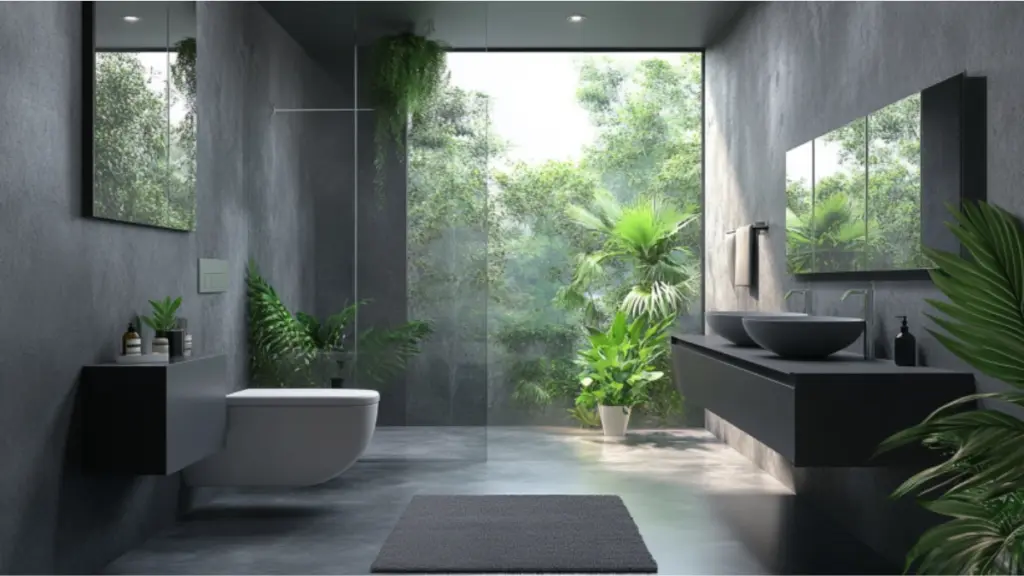
Greyscale elegance with monochromatic layering
Grayscale palettes bring a sleek, sophisticated edge to modern bathrooms. From crisp ash to deep charcoal, gray tones offer depth without heaviness—especially when layered smartly. A monochromatic scheme using light to medium grays for walls, tiles, and cabinetry can make a compact space feel cohesive and deliberate.
The key is layering various shades of gray with texture. For instance, matte gray paint can be paired with stone-look porcelain tiles or ribbed glass. Floating vanities in soft charcoal can ground the room while pale gray walls keep it from feeling closed in. Introducing metallic elements like chrome or brushed nickel adds contrast and a contemporary touch.
Too much dark gray can make a small space feel boxed in. That’s why balance is crucial—use lighter shades on upper walls and darker tones for accents. Introduce greenery or light wood to warm up the palette and avoid sterility.
Monochromatic Gray Palette Layers
| Shade Level | Suggested Use | Effect on Space |
| Light Gray | Walls, ceiling | Opens up space, softens edges |
| Mid-tone Gray | Tiles, vanity | Adds depth without weight |
| Charcoal | Accents, hardware | Grounds the room |
| Silver/Chrome | Fixtures, lighting | Enhances reflection, adds polish |
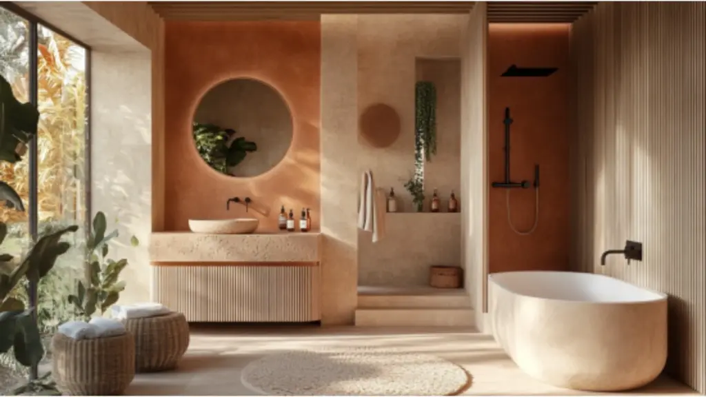
Earth tones that warm and widen small bathrooms
Earthy tones bring comfort, calm, and a connection to nature—especially beneficial in small bathrooms where every sensory cue counts. Think taupe, sand, terracotta, and olive. These colors have a grounding quality but are soft enough to reflect light when used correctly.
Unlike whites or pastels, earth tones offer warmth without feeling heavy. Taupe walls paired with sandy tile flooring can make a small bathroom feel spa-like. Terracotta or muted clay can be incorporated through accessories or a feature wall, adding character while maintaining cohesion.
Pairing earth tones with natural materials is key. Consider adding woven baskets, wooden shelving, or stone sinks to reinforce the palette’s natural vibe. Fixtures in brushed gold or oil-rubbed bronze also complement these colors beautifully.
This palette works particularly well in bathrooms with good lighting. If your space lacks natural light, choose earth tones with a hint of luminosity—such as beige with gold undertones or a warm greige.
Earth Tone Pairing Inspiration
| Earth Color | Paired With | Best Feature |
| Warm Taupe | Cream, wood, brass | Cozy, neutral foundation |
| Soft Terracotta | White, clay tile, bronze | Adds rustic charm |
| Olive Green | Beige, natural stone, linen | Brings nature indoors |
| Sandy Beige | White, light gray, jute | Keeps room feeling sunny and soft |
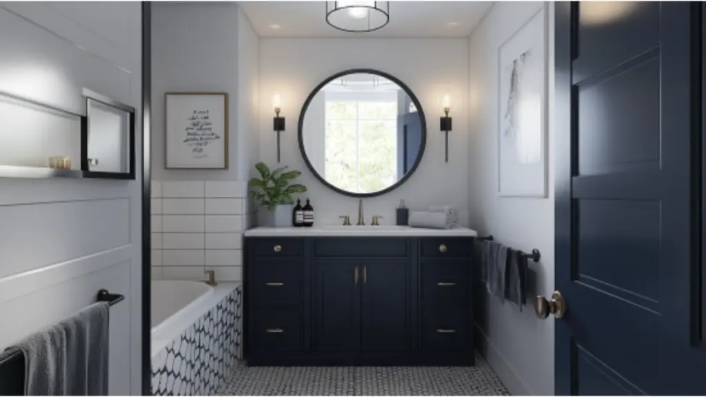
High contrast palettes for bold but spacious designs
While it may seem counterintuitive, high contrast palettes can actually make a small bathroom feel larger—if done right. The trick lies in using contrast to define boundaries and create visual interest. Black and white is the most popular combo here, but navy and ivory or deep green and blush also work beautifully.
In high-contrast bathrooms, light-colored walls combined with darker vanities, trim, or flooring provide structure and draw the eye around the space. This visual movement gives the impression of more room. For instance, white walls with a black hex tile floor or a navy vanity can feel striking and expansive, rather than enclosed.
To maintain balance, keep the lines clean and avoid clutter. High contrast doesn’t mean chaos—it means clear distinction. Mirrors and glass features work wonders in such schemes by amplifying light and softening edges.
Add pattern sparingly. A single accent wall with bold tile, or a striped towel in a contrasting color, is enough to energize the space without overwhelming it.
Balanced High Contrast Bathroom Ideas
| Contrast Combo | Where to Use | Tips for Balance |
| Black & White | Floor and walls | Keep fixtures sleek, minimal decor |
| Navy & Ivory | Vanity and tile | Add gold accents for elegance |
| Deep Green & Blush | Wall paint and towels | Use matte finishes to soften look |
| Charcoal & Pale Gray | Cabinetry and countertops | Blend with wood for natural warmth |
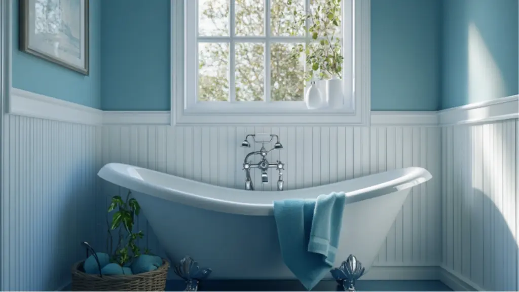
Muted blues and sea tones for a serene, open look
Blues are naturally associated with water and calm, making them a go-to for bathroom palettes. But in small bathrooms, bold blues can dominate. The solution? Stick to muted tones—like dusty blue, seafoam, or soft teal—that evoke freshness without overpowering.
Muted blues pair effortlessly with white, gray, and natural materials. A dusty blue wall with white beadboard wainscoting feels classic yet modern. Sea tones also work beautifully in tile mosaics, lending texture and depth without visual clutter.
Metallic accents like brushed nickel or matte black elevate the look, while natural light enhances the airy vibe. If you’re hesitant to commit to wall color, try introducing sea tones through shower curtains, bath mats, or towels.
Sea-Inspired Color Ideas
| Blue Shade | Complementing Colors | Ideal Design Use |
| Dusty Blue | White, wood, chrome | Wall paint, tile backsplash |
| Soft Teal | Cream, beige, nickel | Vanity, shower curtain |
| Seafoam Green | White, gray, natural stone | Accent tile, decor elements |
| Slate Blue | Pale gray, light oak, gold | Floor tiles, wall feature |
Conclusion
Designing a small bathroom doesn’t mean compromising on style or comfort. The right color palette has the power to transform a tight space into a tranquil retreat. Whether you gravitate toward calming pastels, warm earth tones, bold contrasts, or timeless whites, there’s a strategy behind each hue that enhances visual spaciousness.
By thoughtfully layering tones and textures, and pairing them with complementary materials and finishes, your small bathroom can feel bright, open, and utterly modern. Use color not just to decorate—but to elevate the sense of space. And remember, sometimes, it’s the subtle shifts in shade that make the biggest difference.